Ad Reinhardt, a 20th Century artist, who is known for almost completely black paintings is known for the concept of “less is more” or “minimalism.” The artist should be able to convey a thought provoking image with limited visual components through minimalist photography.
When you approach minimalism look for elements of light, shadows, colors, textures, lines and space. The focus of your subject will be isolated and projected with minimal detail.
“The more stuff in it, the busier the work of art, the worse it is. More is less. Less is more. The eye is a menace to clear sight. The laying bare of oneself is obscene. Art begins with the getting rid of nature.”
Ad Reinhardt
Keep It Simple with Minimalist Photography
Sometimes the best images are the simple ones. Your photos is more powerful because the distractions have been eliminated. Try to create something that will stick in the viewers mind.
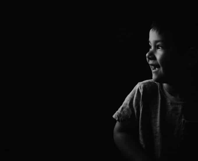
You only want to include the minimal amount of information required to tell your story. For instance, this may include lines, curves, colors, textures or negative space. Below, my son is feeling the grass as it sways in the wind. You can feel the storm coming without anything else to contribute to the image.

Using Negative Space in Minimalist Photography
The subject of your photo is the positive space and the space around your subject is the negative space. Sometimes, we think a good photo needs to get in close to get all the details. However, it’s maximizing the space around your subject that takes your photo to the next level.
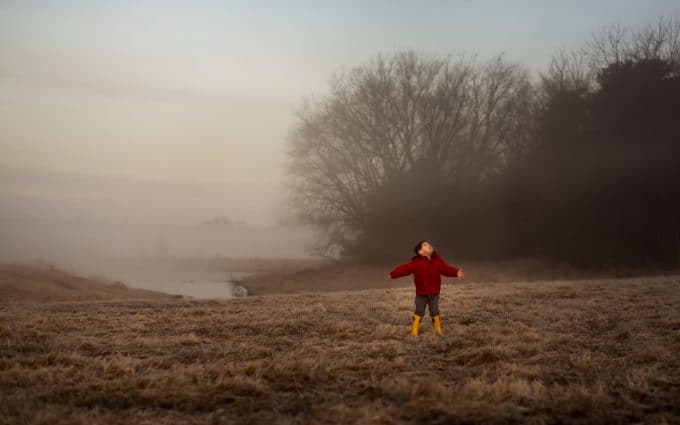
In the example below, a blanket of fog hangs in an empty field. The space that surrounds my son allows him to stand out. Therefore, the pop of color and empty field helps create a unique feel to this photo.
Tell a Story
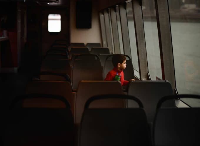
Everyone loves a good story. I am a big fan of story telling images. We want to use less to create more. You can tell a strong story with the right elements fused together. In other words, don’t be afraid to combine angles & composition to tells your story.
Embrace a shallow depth of field
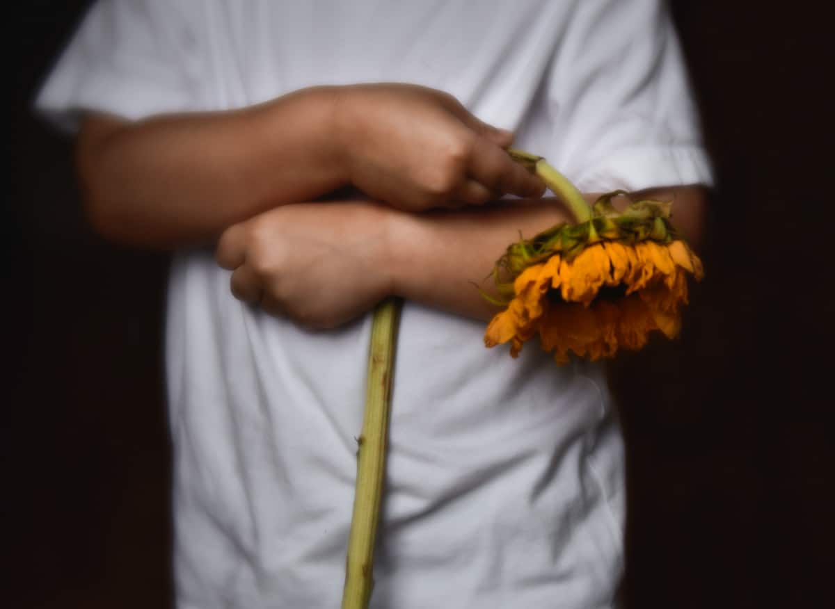
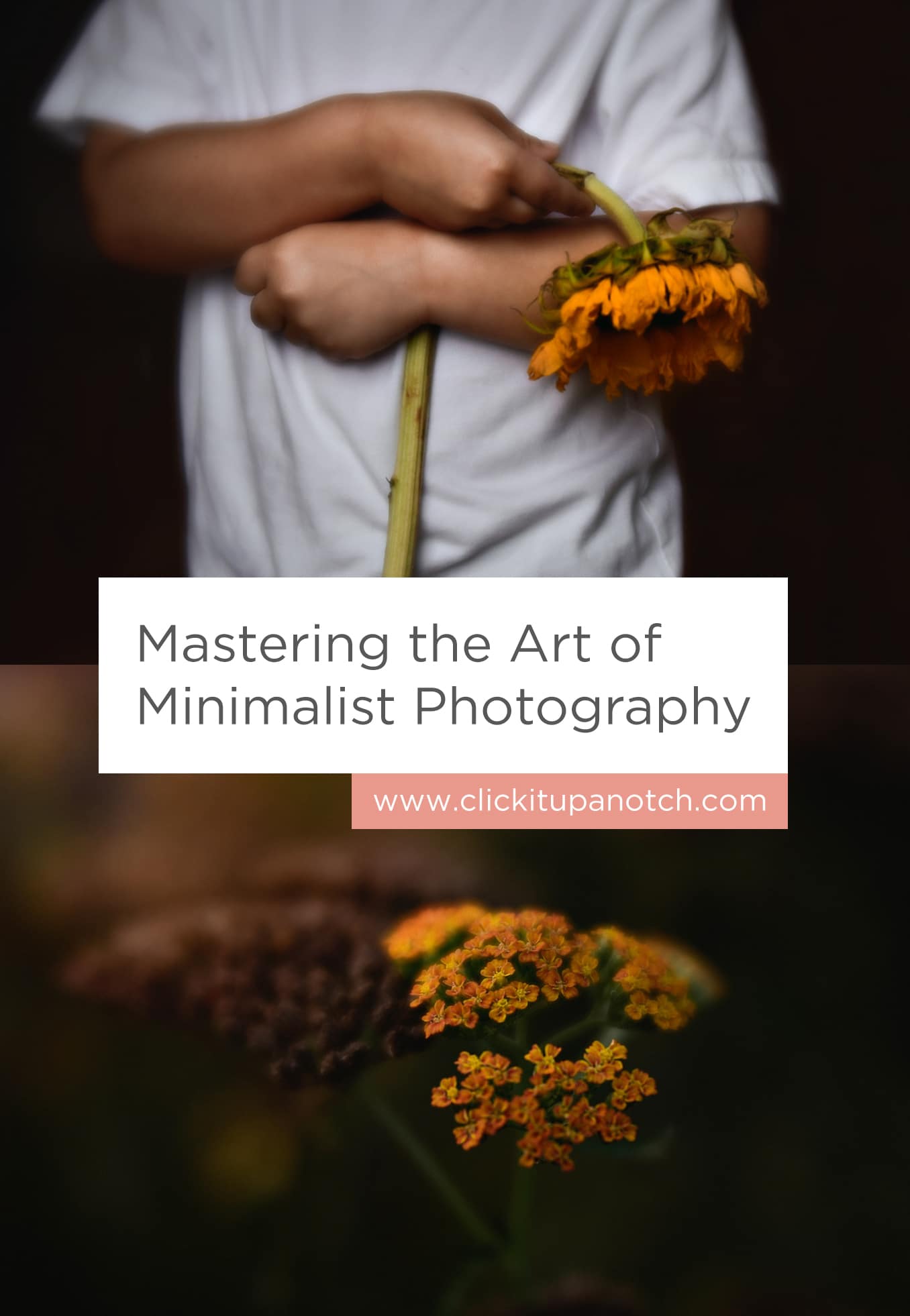
In the following image, I used a shallow depth of field for my subject in a dark room by a window. Therefore, this created a dark background that eliminated unnecessary distractions.
All you see in his arms folded with the dying flower hung over them. This lets your imagination wander. Why is he holding a dead flower? What is he feeling?
Use of Lines or Patterns
Think about the leading lines and/or shapes to draw the viewer’s eye through and across the image. These leading lines are very important and can be very influential in your final image.
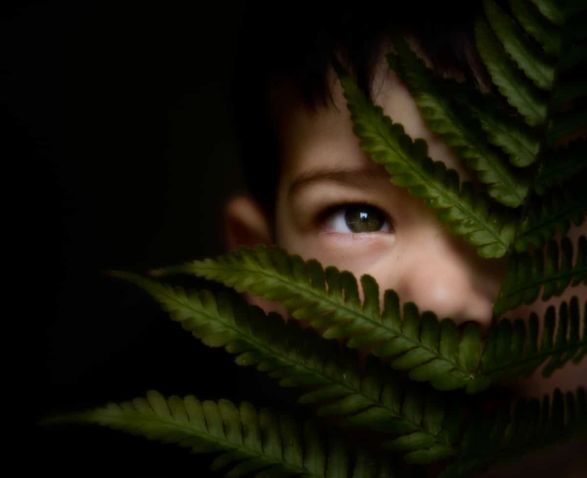
Strong lines or patterns can show a sense of depth, separation, isolation or proximity. For example, below there is an open space flanked with lines of fern leaves. The background is completely dark due to shallow depth of field so that you are not distracted by the space. Your eye immediately travels up the lines of the fern to the one single eye that is peeking through the opening.
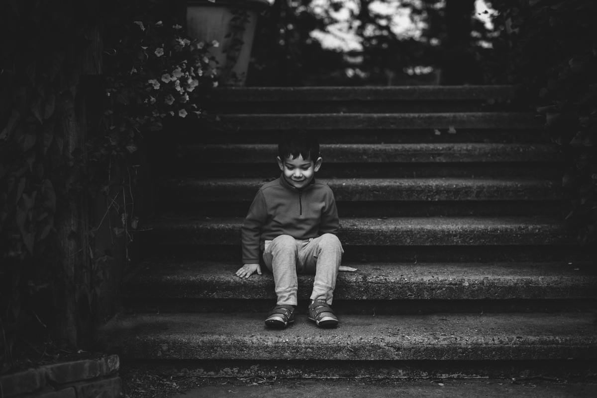
The straight lines of the stairs lead me to my son as he sits amongst them. For instance, when I edited this image, I converted it to black and white so that all you see is the shadow and light play on the stairs as my son sits offset in the middle. Next, I burned the foliage so that your eye was not distracted by it but left slight highlights to give a sense of environment.
Look Out For Details
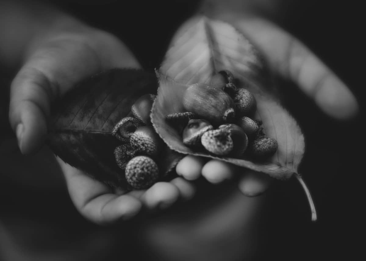
Sometimes, I just want to capture tiny details of life that we seem to oversee on a daily basis. I love that my son collected these freshly fallen acorns on a recent walk along with leaves that are beginning to show color. What I love even more is the textures when they are combined.
Play With Your Editing to Create a Minimalist Photo
You’ll notice I converted this to black and white so that just his tiny hands and nature collection were emphasized. Next, I burned the space around his hands and brought out the light and highlights on the leaves and acorns. After that you only see what I wanted you to see.
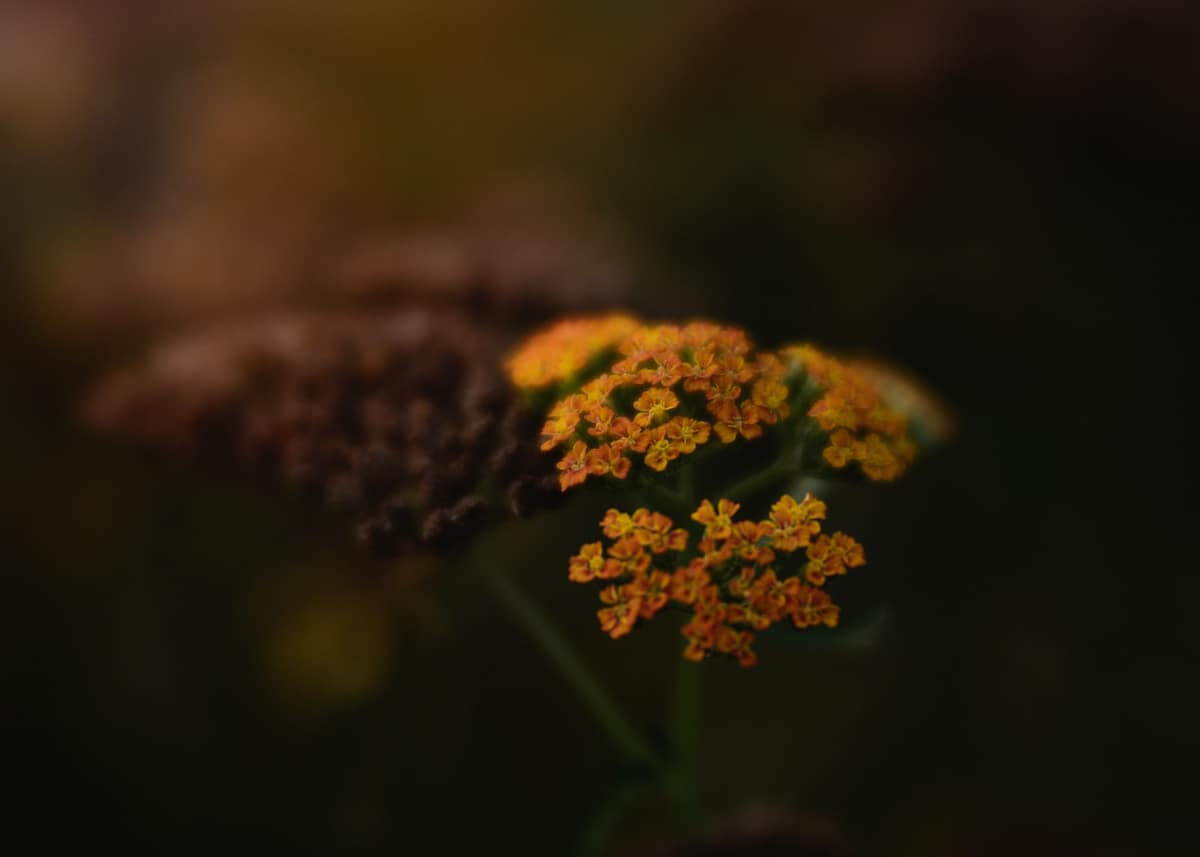
For example in the next image, there is a cluster of orange flowers. The sun was setting and a little bit of warm light was still shining on the cluster of flowers. I underexposed the image to emphasize the light and flowers. The brown flowers and muted greens that surround the subject allow your eye to not be distracted by other details.
Look for ways to incorporate minimalist photography into your work
Above all, next time you take your camera out shooting, pay attention to what you notice. I challenge you to think how you can minimize the frame so the viewer sees your vision.
Discover more about composition for minimalist photography:
– 8 Composition Mistakes to Avoid
– 5 Tips for Shooting with Composition in Mind
– Storytelling Through Light, Emotion and Composition


Thank you, Click it up A Notch for having me!
Thank YOU for such an incredible tutorial! Loved reading it and picked up a couple of things I can’t wait to do :)
Wow, I have never even thought of minimalist photography until now! I know I’m going to be obsessed for a while. Thank you for the great inspo!
You are welcome, Jamie!!!! I am glad that I could share my knowledge :)
Sarah, may I ask what lens you used for photo with the hands holding the acorns? is it a 50 1.2? I I love these and want to try and practice getting minimal – Thanks so much for this great tutorial!.
Hi Jodi! I am sorry for not seeing this. That image is taken with a Nikkor 50mm f/1.4 :) and you are so welcome!
Thank you. A great little read that has given my brain something to think about. Your photos are beautiful.