Symmetry is a tool to create interest in images. Using symmetry can make you subject pop by downplaying other distractions. Symmetry can be calming, just ask anyone with OCD! Looking for symmetry in the environment whether it be from lines or repeated patterns is the easiest way to create it in your images. However, occasionally, getting it “just right” may prove a little difficult in camera because the environment may not always be perfectly perfect. During those moments, it is absolutely acceptable to manipulate your image if in the end you’ll have a stronger composition.
*This post contains affiliate links. Thanks in advance for supporting Click it Up a Notch.
Straight Out of Lightroom in all of its asymmetric glory :)
Nikon D700 | 85mm f/3.2 | 1/800 | ISO 400
The image that I chose is a very simple one. The fog was very thick one day last fall and I thought it would be fun to take a few images of my youngest with his lovey “Monkey or Munkles” down on the boat docks. The dense fog makes the background somewhat disappear. The colors in the subject of the image are calming and muted (green blue, pink skin), while the colors of the dock are almost colorless (gray, black, brown). I wanted the image to reflect the quiet moments that we had together down on the docks, so in critiquing my image I took note of anything that distracted from my subject or did not add to the story that I wanted to tell. Once I did that, I realized that the image wasn’t perfectly symmetrical and I set ahead to do that.
In critiquing an image, I also ask myself, what could I have done “in camera” to improve this image? First, I think I would have crouched down a little more so that my position would have made the horizon (the separation of the trees/land/water not go through his head. Secondly, I may have been able to eliminate the area of the dock that isn’t symmetrical by moving my subject and myself a little further down the dock. But! I didn’t, so here I am in photoshop correcting the mistakes that I can.
Let’s get to the point!
First, I edited the image as I normally would in Adobe Lightroom 4 (I know! Adobe Lightroom 5 would change my life, so I hear). Then I took my image over to Photoshop. Here I went ahead and added a matte look that I love. This is my polished image, with exceptions to symmetry.
Follow these steps to create symmetry in your image using Photoshop.
1. Go ahead and flatten your image if you have finished with your other editing. Or you can start with creating symmetry and save your polishing edits for last. Either way, start with a flattened image.
2. Make sure you are clicked onto the background layer, then grab the Marquee tool. The shortcut is just pressing M. Draw a box around the area that you would like to be symmetrical on the opposite side of the image.
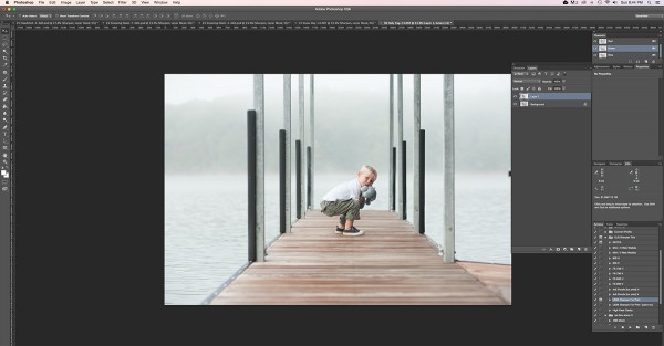
3. Third, duplicate the selected area by either going to Layer > Duplicate Layer (then naming the layer) or by using the shortcut by pressing Control or Command J. The image will look the same until we flip that layer.
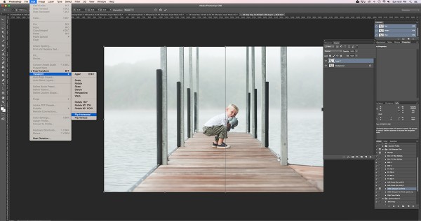
4. Now we flip the selected copied area to make it symmetrical on the right side of the image. Edit > Transform > Flip Horizontal (sorry, no shortcuts here) :) Not quite how you expected it to look?
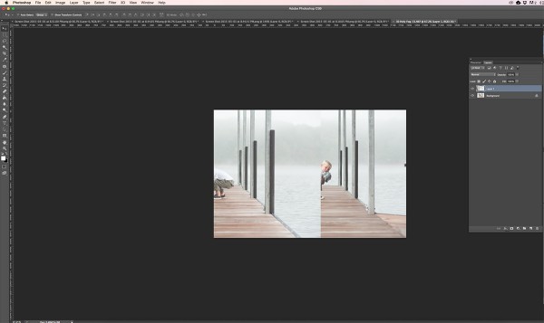
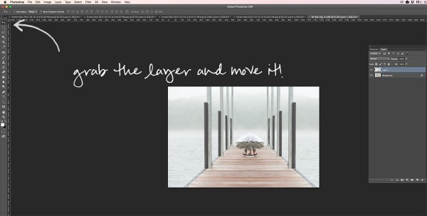
5. Next, make sure you are clicked on your layer and the pointer/arrow tool and drag the flipped image where you want it. In this case, it still isn’t perfectly symmetrical, but I plan to crop a bit when I’m finished, or maybe stretch the canvas a little, so it should turn out how I expect.
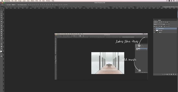
6. No we are going to make my son look like he has a head instead of two bodies. Create a mask on the flipped layer. Either press the layer mask button in your layers pallette, or make sure you are clicked on the “Flipped Layer” and go to Layer > Layer Mask > Apply and click ok.
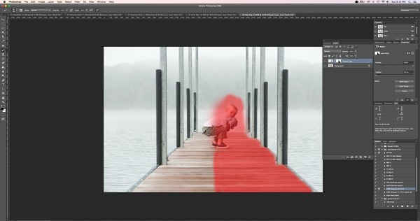
7. Now using the black round brush and your layer mask clicked, start removing the image that you wish NOT to be symmetrical. In this case that would be my son :) Shown in red is what I masked off of the background image…meaning I allowed the background image to shine through.
8. Finally, I cropped a tiny bit to put my son right in the middle, further making the image symmetrical. And done! These steps took just a few minutes from start to finish. Thanks for reading!
Before:
After:




This post makes me realize I have so much to learn! Thank you for sharing!
http://myneedforcreativity.blogspot.com
Love this tip. Who knew? I agree with the commenter above … so much to learn. Thanks for keeping this simple Laurie!