Remember:
-Read How to Critique a Photo
-Make a critique sandwich – something positive, something you would have done differently, something positive
-My rule: no improvement tip = deleted comment
-This will benefit the person leaving the photo critique just as much if not more than the person receiving the critique.
-If you would like to have an image critiqued be sure to read How to submit an image for critique.
Thanks to Chanel French for submitting the following image.
Settings: ISO 100 | f/2.8 | SS 1/400
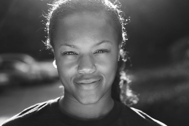


I really like the use of the light and I feel like you captured her expression very well. If I had to try and find something to improve here, I’d say maybe to have had a more contrasted black and white would have defined her face a bit more VS the background. But it’s a great shot for me :)
Love the lighting, love the bokeh. Maybe a bit more contrast could brighten things up, but a beautiful and simple photo!
Beautiful Portrait. The catch lights in the eyes are great. I am slightly distracted by the light at the girl’s ear which distracts me from her eyes so I would have removed or dulled the light when editing.
Thank you for pointing that out! I completely missed that, but sometimes it takes a second pair of eyes to point out distracting features. Thank you for the feedback!
This is a beautiful photo. I like how it doesn’t feel staged. And the model is absolutely beautiful. Not knowing the size of the original picture, would you be able to crop it so that the subject wasn’t in the middle? It feels just a little too heavy on one side. I would move her to the left if possible. There is something about this photograph that makes me want to keep looking at it! NIce job!
Love the lighting behind her. Sharp focus on the eyes. Perhaps putting her more to the left or right and utilize the rule of thirds.
Beautiful photo. It is very dramatic and captivating. Personally, I’d like to see her whole head in the frame. I really love the ctachlights in her eyes and the expression on her face. Nice shot!
Beautiful photo. I love the expression. I might have adjusted the frame slightly to include the very top of her head. The background bokeh is lovely. Great job!
I love the backlighting in this! And this is mostly personal presence, but I think next time I might bring whatever is lighting her face up a bit or move it around a tad to get rid of the shadow on her upper lip. I love your conversion to black and white! Her eyes and skin look so beautiful!
I love her realistic expression. I also would have upped the contrast a bit, which would have defined her face, and brought out the beautiful catchlights in here eyes even more!
What I like is the rim lighting. It really gives texture to her beautiful hair. I think that a slight, ever so slight show of her teeth in the smile would match that squinch better. And with that said, her eye expression is great.
I really love this photo. The catchlights are great, as is the bokeh. I would have liked to see the top of her head, as you have a beautiful halo around her hair. I also may have tried to capture the rule of thirds more. I think she is beautiful, I love the hint of smile you’ve captured, and the black and white is perfect.
I love the catchlight in her eyes, beautiful! For me I would have backed up a little to get her whole head in the picture and moved her to the side so it wasn’t dead on center. I love the light behind her is beautiful, it looks like she is glowing.
love, love love the great catch lights you captured here. Would love to have seen her whole head and not have that chopped off/missing piece feeling, but her smile/expression more than make up for it so over all I love it. Great job!
I really like the shot, to me it’s a flirty gaze and quiet smile. Which make it soothing.
I would have cropped the dark side -right- of the picture and would have her head complete not cropped.
Making picture vertical vs. horizontal.
I would have aimed for a little more contrast or shadows.
Overall I really like it!
Love this portrait. First I was trying to see if I had something to change, but if yes, it would be having it in portrait and with her not in the middle. The light is great like it is!
I love the backlight in this image. She looks like a young athlete, so maybe include a little of her environment to tell the rest of her story. She has a very strong look about her.
Hi Rozina! Thanks for the feedback! I keep hearing she looks like an athlete in this photo but it just happened to be I needed to practice natural lighting techniques and she threw on a t-shirt and a ponytail after work lol!
I love her face! It’s so intriguing. I find myself asking questions about her. My only comment is that I’d like to see her face fill the frame more. Her Mona Lisa smile is gorgeous and I feel that the background is a little distracting. I love the black and white here. Beautiful.
something about the top of her head draws me away from her eyes and face, I think it is a combination of the light around the top of her head that distracts me and the fact that the top of her head is cut off, I would have backed out a little bit and maybe had some more contrasting in the background to where she stands out a bit more, but other than that it is a great shot, I love the expression in her face and makes me wonder about her and who she is…. really great!
Love this in black and white! The focus on the eyes is good, and the catchlights in her eyes are wonderful. Upping the contrast would make it a more dramatic image, and it would be nice to see her whole head. Great shot! She looks so natural, and the blur really makes her be the focus.
Great shot! I love the use of light and the black and white edit. Her expression is very real which I love. I also love the connection. The only suggestions for improvement would maybe be standing back a bit so the top of her head wasn’t cut off. Great job.
Holy Rim Light! That looks fantastic! Only improvement would have been to include the top of the head but I’ve been there and taken a perfect shot only to realize that you cut an arm off so it happens no matter how long you’ve been doing photography. I LOVE landscape photos but this might have worked vertically too. Great shot!
Love her expression!! The light behind her could maybe be toned down but just a little!! The b/w really works well. Thanks for sharing!
Well, I too like the back light, although “I” think it’s a bit strong since the background is so dark. I like the light on her face, but, once again “I” would like to have seen it a bit further away so it would not be as strong as it is and that way it would soften her face just a bit. Maybe held the light a bit higher or whatever it is you used to shine the light on her face. Just my opinion and as you know it’s all personal taste. I would have put her on the right side of the photo since her head is tilted to the left. Then again I could be wrong on everything I am saying :) Overall nice shot!!
I love black and white portraits and you have managed to make this one super interesting with the catchlights in her eyes and the awesome bokeh. I agree that the cropped head is distracting and my eye is immediately drawn to it because of the back light. I also agree that a little more contrast is needed. You have captured the essence of your subject beautifully :-)
The photo and the subject are both beautiful! Although not huge, post processing some of the bright light around the subject. Great bokeh.
I love the lighting on this photo! And her expression says…..I know something you don’t know! I like the composition and am not bothered by the cropping of the top of her head. It’s not enough to make me wonder what am I missing. I do agree with the comments about the light on her right ear (our left). Maybe it’s the reflection of light on an earring? It is a little distracting, but that is the only distraction in this great photo. Thanks for sharing!
I absolutely love the warm, inviting atmosphere of this frame! The only thing I would do differently (and this is completely a matter of preference) is smooth the skin just a little more and maybe a little contrast to the eyes. Again this is just a matter of preference, but I really do LOVE this picture and your use of backlight!~
I adore this photo! You can tell her personality and sweetness show through the image. If i could change one thing i would focus on the brightness around her head and maybe dull it down a little to remove from the excessive glow to her hair. Other than that wonderful photo and beautiful editing.
Lovely photo, I really love the wispy backlit curls of her hair! I perhaps would have cropped/framed it differently; perhaps portrait or a very tight crop to her face. I think B&W was a great choice; really accentuates her features.