Remember:
–Read How to Critique a Photo
–Make a critique sandwich – something positive, something you would have done differently, something positive
–My rule: no improvement tip = deleted comment
–This will benefit the person leaving the photo critique just as much if not more than the person receiving the critique.
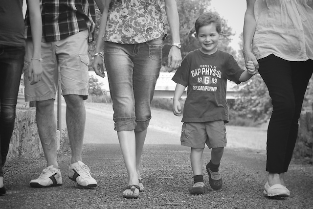
Thanks to Amanda for submitting the following image.
Setting: SS 1/2500, ISO 400, f/3.5


What a great smile on the little man’s face – you captured a great expression. I really like how the lightest ares of the photo frame him – it helps to draw attention to him as the focus of the photo. The person to the left of the little boy looks to be the most in focus, though. I would like it if he were a little sharper and if there was a little more contrast on him — it looks like the in focus person has the best color/contrast. In addition, the person in the far left of the frame is cut off rather awkwardly – wish they were not in the photo at all. I know it’s hard when folks are moving, but the person on the right of the frame also looks to only have one foot. Overall, though, he looks happy and loved!
Your little boys face is just priceless! Good choice on converting it to black and white…it prevents any color distractions and instead adds a lot of extra beauty to the picture. Although if you wanted the main subject to be the little boy(as it seems you did) i probaly would have lowered the aperture number to make him pop out more, while still showing the other people. I also think the person on the far left is cut out in a funny way… i think the picture would look more even and balanced if it was cropped out some. All in all though, i think it is a beautiful picture! Great job!
I love the levels in this photo and I think its a great way to immediately draw the viewer into the little boy. The one thing I’d experiment with is the exposure on his skin. His face is almost the same tone as the trees behind him and even though I know he’s in a shadow, I think I’d try upping the exposure on his skin just slightly to make him pop out from the grey background. Overall I think this is a great picture, and I love how you’ve captured his smile and happy-go-lucky look.
Such a cool perspective. We adults forget what the world looks like from a child’s height.
Like others have stated above, you did a wonderful job capturing his sweet expression.
The arms and legs of the people on each side of him form an almost perfect symmetrical shape.
It’s a nice use of negative space. I would use that to your advantage and crop in tighter… center him and have a nice design element.A square crop… or one close to a square… would look lovely. I’d also add a little more contrast to pop him out more.
This is such a sweet image.
Brand new to DSLR (One week with a Nikon D5100) so this will be a rookie critique.
That little man has such a sweet smile. I like how he looks like he has a secret. Draws you in. :)
The pole behind the man is a bit distracting. Wonder if that could be edited out?
I’m a big fan of black and white. Thanks for sharing.
Thanks to everyone who commented. I was able to learn a lot and will continue to play around with some of the critiques that were given. Thanks again and have a great week!
I love this perspective, very creative! I find the person on the left hand side who is cut off distracting and it’s taking my eyes away from the focus (that adorable lil man!) I love that you made this B&W! Good work!
Great picture Amanda! Thanks so much for submitting your image for us to critique!
First of all, I really like this shot! I think it’s really cute to get to see from the little boys perspective. I learned from Click it up a Notch a great way to do a black and white conversion, and one of the tips she gives is to change the temp of the picture so that it is on the far yellow side. You could also brighten up the oranges or yellows in the pictures. I really like using this technique because it makes the skin really bright (I had so much trouble with that before I watched her video!). I think this would be a good thing to do so that your subjects will have bright, glowy skin. That will also draw your eye right to the little boy. The only other thing I can think of would be the awkward crop on the girl on the far left, but I really like everything else. Great job!
How cute is he?!? I love the perspective of this since you got down to his level. From your settings, it looks like you may have been able to drop down your ISO some and compensate with your ss. I may have cropped it as a vertical image, to further remove distractions that draw me away from the boy. I think the B&W choice was perfect, by the way! Beautiful image.
I love photos like this! Great job! I love everything about getting on that level of a child’s world, making them the focus of the photo. I would make a tighter crop. The adult on the side is awkward and could be cropped as much as possible without loosing to much of the adult in shorts. I also think it can use some contrast and make the little boy pop. It is a great photo! Good job!!
what a sweet little guy! To me it feels like a cropped photo, like there should be more. I would have tried to get all the bodies in the frame so you arent cutting them off in weird places. Also the arms and hands are very dangly and destracting, I would have had them put their hands in their pockets or bend them somehow so they werent just hangning. Nice job keeping it sharp while in motion!