Remember:
–Read How to Critique a Photo
–Make a critique sandwich – something positive, something you would have done differently, something positive
–My rule: no improvement tip = deleted comment
–This will benefit the person leaving the photo critique just as much if not more than the person receiving the critique.
Thanks to Hannah at Hannah Elizabeth Photography for submitting the following image.
Settings: ISO 200, f/4.2, SS 1/500
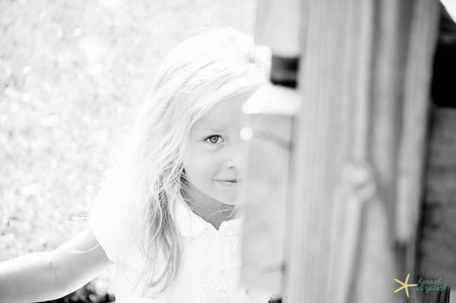


What a sweet image. I like that it’s in B&W…I personally don’t see anything that I would do different.
I love this light and the fact that it’s black and white. I would crop or clone out that small white triangle in the top right corner. I also love that you can only see half of her face b/c it’s a different view.
Lovely photo and with a timeless feeling to it. The composition is great.
I would have darken the foreground to have more contrast between the foreground and the girl in the background. That will allow us to focus more on the girl with her beautiful smile.
I enjoy your composition as well. I would like to have seen the background a little less blown out. Your eye is immediately drawn to that bright spot on her shoulder, as it is the brightest part in the shot, but you want the attention on your subject. Especially since I love her expression and how she is hiding – I feel like we are playing a game of hide and seek, which helps me feel connected to the image.
Love the photo – the black and white, the leading line from her arm up to the eye, which is in sharp focus. I’d crop at the corner of her hair and remove from the black square over.
What a cute little girl! I love the feel of the black and white but I agree that the photo is overexposed. I probably would have increased shutter speed a bit. Did you meter off of her skin? The composition doesn’t really work for me either. I would like to see both eyes. Just seeing one eye doesn’t feel intentional in this case (as opposed to photographing a child peeking around a corner or tree). I do like that you shot her from above and you really nailed focus! Her eye is so clear! Nice job!
This is a beautiful picture! I love the b&w. The only thing I would do differently is bring the little girl out from behind the object. I understand it’s probably supposed to be a peek a boo picture, but the object is way too distracting, and the little girl is so pretty. Honestly that is the only thing I can think of, I love the setting, and everything else.
I love this image and that it is B&W, because it captures the timelessness of it. I also would have cloned out the top right hand corner. I love bright images, but I would have added a bit more contrast to the background so her face and stood out even more. What an amazing lifestyle photo…I love the in the moment feel of the picture. Great job!
I really like the image as a whole. Even though I like high key images, this one might be a bit much for my taste. I would also consider cropping in from the right side of the frame to move her a bit out of the center of the image. I really like seeing just one eye. It tells the story of having fun and playing.
I love this photo! I feel like perhaps there is a little to much of the wood in the picture. I would have shifted the little girl to the right a bit so she was less centered and there was less obstruction. I love only seeing half of her face, I think it adds a fun feeling to the timelessness of the b/w. Great picture!
I like her Expression with a gentle smile… like Half covered face.. Excellent Composition with black and white.
Suggestions: Little more Contrast, little Darker foreground / foreground just to popped her out a bit. I feel her hair is little Over Exposed.
But surely it’s a Great Piece of Work… !
I feel a bit funny leaving a comment because I’m SO NEW to taking pics but… I love the playfulness of this picture- makes you want to jump in & hide too! I do feel like its a bit too gray & needs more contrast in black & white. I’d also crop it a bit closer. My focus goes to the girl’s eye- great job!
This is a cute picture! The eye is really sharp and I love the definition in the eye that I see. I do feel that the left side is extremely overexposed and that there are some blow out situations. It also looks like maybe the blow out situations were created by desaturating certain color channels in B&W? Also, the head is smack dab in the middle, I’d use the rule of thirds on this one and move the eye (point of interest) to the left and have less of that blown out situation on the left.Maybe even add a light vignette/burn to the left side. I think that would also balance the stark contrast between the light part on the left with the dark part on the right. Also, the structure on the right might be a great leading line to her eye depending on the perspective and if you can recrop. This is a great capture. This is one of those fleeting moments you don’t want to forget. Also, eye contact is huge in my book.
Love the peek-a-boo photo, she is so cute. When I first looked at it though, my attention was brought to the far left corner, due to the overexposure. I think B&W was perfect for this photo though! Great job!
I think this is a cute photo. I love the B&W but perhaps would have added more contrast especially just behind the girl. I think it’s a little too bright just behind her. I like the composition but may have cropped some more of the right side out. I love how she’s peeking out from behind the wood. Great photo!
I love that you chose to make this photo black & white. I like the whimsical feel of the similar contrast. To improve this, there are two things I would actually do, crop the dark right side of the photo off because it takes away from the light whimsical feel of the photo and use the rule of 2/3 since you can only see half her face. You have caught her innocence of hide and seek perfectly. The spot on focus on her eye is amazing. I am working on perfecting this and it seems like you have done just that. Well done.
This photo evokes such playfulness only found in young children. Excellent work!
I really love this picture in Black and White. I think I would have preferred to see both eyes in the picture. It just keeps distracting me that we can only see one of them. I think it I would also try to use more contrast. Great job!
I love the brightness of this photo and the choice to have it in black and white. I’d also love to see it in colour. If i could do one thing differently I might try rotating the frame just slightly so the boards (the fence?) are parallel with the edge of the picture. Beautiful little girl and the focus on her eye is spot on! Love it.
I love black and white photos-so timeless and simple, but yet they can say so much. The only issue that I noticed was that her hair somewhat blends into the blown out of the background and her shirt, so maybe adjusting settings or working on the editing. The composition of the photo is just great! I love that the focal point is her eye!
I like the idea of the picture…how she is partially hidden and being playful. I’m really distracted by the object on the right. Light seems to be reflecting off the part of the object that is covering her nose and makes it hard to appreciate her beautiful face as much as you should. In an effort to improve this picture I would try cropping it a bit on the right side. This is a good shot to have as part of a series showing how she acted throughout the shoot.
I love love love! this image. I would have personally framed in tighter so that the middle of her face was a little more to the right of the image and there was less of the wall actually showing. I think also that a little bit less exposure would have helped with the hair blending into her shirt and the background. I love the black and white, it seems to fit with the image. Maybe try a high contrast b&w next time, it might make everything pop just a little more :)
Aw! LOVE the B&W! You def made a great choice there! I know that you meant to have half her face covered for that “artsy” feel, but PERSONALLY I would like to see her whole face peeking out. But ya know, that’s just me. :) Love how this photo looks like it ‘sparkles’. Nice Job Hannah! ;-)
Very cute subject the picture tells a story and I love how you captured that! The B&W makes the photo much more interesting I would love to see just a little more contrast. Great job capturing a playful moment:)