Remember:
–Read How to Critique a Photo
–Make a critique sandwich – something positive, something you would have done differently, something positive
–My rule: no improvement tip = deleted comment
–This will benefit the person leaving the critique just as much if not more than the person receiving the critique.
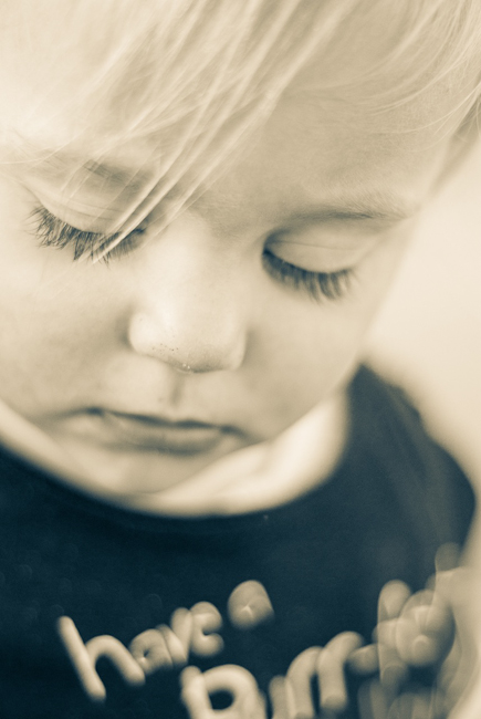
Thank you to Sara at Sara Jennings Photography for submitting the following image to be critiqued.
Settings: ISO 250, SS 1/1600, f/1.8


Hi Sara! I love the softness of the eyelashes, and wispy hair on the boy! What a sweet face. I love the tone in the image. I think I would have closed down the aperture a bit to sharpen the foreground as well as parts of the face such as the lips. Also I kind of find myself wanting to see more of the left side of his face. His face seems a bit cut off. Overall, the image conveys a sweet innocence that I really like. Had a look around your site too and you have some beautiful work!
Oh Sara, this photo is so sweet. I love the tones and softness of this image, just captures the little boy’s innocence perfectly! I would have loved to have seen the negative space to the left side of the photo, that way he isn’t looking out of the frame. With him looking out of the frame I want to know what’s just beyond his gaze. Also I would have closed your aperture up a bit to get both eyes in focus, however if the negative space would have been placed to the left side of the frame, I think having the closet eye just in focus would have worked. But seeing those sweet eye lashes always grabs at me, they are stunning. Again, I’m in awe of your processing, so soft and sweet, I would love to know what you did if you’re willing to share. :)
Sara, I really like the composition of this photo. HIs lashes and pouty lips draw me in. With that said, I would consider a more square crop, as I am distracted by the writing on his shirt. Or you may be able to erase the writing in post processing. I would also say raise the f-stop a bit, so that both eyes are in sharp focus. The focus is a little soft, so I am unsure, but I think it is primarily falling on his cheek/nose camera left.
The sepia was a great choice. It really sets the mood for the photo.
I enjoy your choice of a shallow depth of field for this shot. The toning on it is also done nicely, giving the photo more of a mood. I find it hard to focus on the child’s face with the writing on the shirt being so prominent. I would’ve chosen a different shirt or taken the writing out in post. I like the focus in the shot and even that it isn’t both eye lashes in focus. But I’d actually blur or clean up the tip of the nose since the most in focus component of the image is the skin on his nose. Last, I like your composition, I think it’s far more interesting then the full face being in view and adds to the the story of the photo.
I enjoy your choice of a shallow depth of field for this shot. The toning on it is also done nicely, giving the photo more of a mood. I find it hard to focus on the child’s face with the writing on the shirt being so prominent. I would’ve chosen a different shirt or taken the writing out in post. I like the focus in the shot and even that it isn’t both eye lashes in focus. But I’d actually blur or clean up the tip of the nose since the most in focus component of the image is the skin on his nose. Last, I like your composition, I think it’s far more interesting then the full face being in view and adds to the the story of the photo.
What a sweet photo Sara! The soft, dreamy quality of the tones works so well with the expression. Together they convey such a peaceful mood. While I really love the softness, I think I would have raised the aperture number a tad to bring more of the facial features into focus. A bit more sharpness on the eyes and nose would enhance the details while still maintaining the lovely overall feel. I love that this photo is all about the face without a straight on expression. The framing, with the face filling most of the photo, is really what achieves that result for me. Thank you for sharing your photo and for letting us learn and grow with you!