Remember:
–Read How to Critique a Photo
–Make a critique sandwich – something positive, something you would have done differently, something positive
–My rule: no improvement tip = deleted comment
–This will benefit the person leaving the photo critique just as much if not more than the person receiving the critique.
Thank you to Sarah of Sarah Jean Images for submitting the following image.
Settings: ISO 400, SS 1/3200, f/2


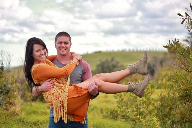
What a beautiful photo! I love the colors! I think I might have fixed the skin tone, especially on the man as it seems slightly red. I really love your DOF and location. Great job!
I love this! The composition is wonderful! The lighting on the guy’s face seems a little harsh (it’s hard to see his eyes) – that may be something to watch out for. But the colors and the expressions are great! Good moment :)
I really love the colors of this picture. Like the first comment above, I think the guy’s skin tone does look a little red but the more distracting thing for me is how he is squinting. If I was shooting this photo again, I might have played with shooting from a differnt angle to see if you could lessen his amount of squint. I do love the tree on the R side that is in the same plane as the subjects because it adds nice texture and interest. Great job! Thanks for sharing.
There are so many things I love about this picture! The expressions, the composition, the location all look perfect to me! I would have lowered the SS to lighten things up a bit. Maybe a reflector could have helped bounce some light back onto the guys face. Over-all it’s a great shot! Good work!
Love this photo, it looks so fun! Maybe move the position of the camera so the gentleman is not squinting. Love the colors and location was great!
I love your DOF and the location as well. The only thing I’d say to work on is colour correction for skin tone on the guy and doing something to get him from squinting. I find it helpful to get the subject to close their eyes and then quickly open them for the shot. Or maybe you just need to move them a bit. BUt def don’t loose that awesome sky. So much texture!
This is beautifully composed. I would lighten him up a touch and take some of the red out of his skin tone, it blends into his shirt. The moody sky is fantastic too. Maybe tone down the whites in the clouds just a touch. This is a feel good picture and I love almost every single thing about it. It inspires me.
What a nice shot! I love the sense of movement, the way that the shallow depth of field makes the subjects stand out, and the composition is spot on! The only suggestion for improvement echoes what has been mentioned before–maybe lightening up the guy’s face a little, and adjusting his skin tone to reduce the red tones. Thanks for sharing!
I actually really LOVE this picture. I’m digging here for a critique. Perhaps his skin is a little too warm ( could be my style though) and the tree to the right brings my eye over that way a little. Just a little blurring would do the trick there. I love the clouds, the pose, the rolling hills…stunning!
I love the composition of this photo! I would probably work on skin tones…they seem a little red especially him. Nicely done! The setting is GORG!!
Such a beautiful photo! I love the composition, their pose, their happy faces. I’d work on his skin tone, it’s pretty magenta, you can fix that with an adjustment brush in LR. Great job!
Hi everyone
Thankyou for the comments!!! Unfortunately this is how Dave smiled. Lol you could never see his eyes :(
Love the natural smiles captured here! I might have muted the colors a little more for a softer look. The pose is great and a fantastic location!
You’ve done a good job with putting them on the left 1/3 of the photo, and you didn’t crop him at a joint! Good job!! What I would have done is in post-processing I would have merged this image with another copy where the clouds in the sky were not so bright and blown out in places, and thus keeping the focus on their lovely expressions! Be careful when you are post processing not to get the color variations in the sky (you can help that out by using layer masks in photoshop and erasing that out of a layer). You did a great job capturing their fun personalities and their relationship.
I think the lighting on the couple is perfect. The horizon line is going right through the image, though….so maybe if you brought a stool or something to the next shoot, so that you can shoot them from slightly higher up the background wouldn’t be an issue. Its obvious that you had a good rapport with your clients, because they look genuinely comfortable with you – great expression