Remember:
–Read How to Critique a Photo
–Make a critique sandwich – something positive, something you would have done differently, something positive
–My rule: no improvement tip = deleted comment
–This will benefit the person leaving the photo critique just as much if not more than the person receiving the critique.
Thank you to Valerie of Valerie Abenroth Photography for submitting the following image.
Settings: ISO 200 | SS 1/200 | f/2.2
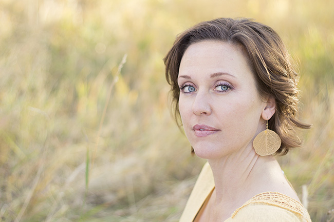


I love the light. Her eyes are certainly the focus, which I think is critical for a good portrait. I would soften the lines on her neck a bit with cloning at 30% they are distracting. Also have you tried saturating the colors a bit? This I believe is more a matter of taste, but the color pallet is a bit muted for my liking.
It’s a beautiful image with nice DOF and I like the color. The only thing that stands out really is the neck creases. If you had tipped the shoulders a little more toward the camera it would decrease how far your subject would have to turn her head and eliminate those creases.
I really like this photo. The bokeh is great. Her eyes are perfectly in focus. I might have taken a little of the orange out of her skin. The sun is shining, giving the back of her head a nice glow. This picture is great.
Great colors in this photo. What I would like to see is her right shoulder rolled forward a little more and her left shoulder rolled back a tad. I’m thinking that would take out some of the creases in her neck. The lighting looks perfect in this though :)
{Shannon}
The color palette is pleasing and natural and the light is lovely against her hair. For potential improvement maybe consider the angle that her head is turned as she doesn’t look as comfortably natural as her surrounding…like she turned just a tad too far. I also wonder what the light would have looked like playing at the front of her face…as if the photo were mirrored and she was on the left of the frame. The light is so pretty that the face seems a tad less vibrant as a result of the light not touching it. I like that she has an unposed “pose” as that concept works well with the obliging field and sunlight coloured shirt…her eyes are also lovely.
Beautiful image! I love how light and airy it feels, and how in-focus her eyes are.
My only suggestion is about color. There is a lot of yellow, and either a yellow cast on her skin or its my eyes playing tricks. I would tone down the background to help her pop more, especially since she is in a yellow shirt. Or even slightly change the background color. (In photoshop- using levels and color sliders in levels, then paint on the color change)
Again, a lovely image! Great lighting and overall composition!
Valerie,
I think you nailed Rule Of Thirds! I might try brightening it up a bit, her skin looks a bit dull. Beautiful colours. And my goodness, she has beautiful eyes!
Great job! :-)
Jody
Beautiful bokeh with great depth. I would soften the crease in her neck slightly. The color against the background is lovely and the photo definitely has emotion to it:)
I love this photo. I like the soft colors, her eyes and nice bokeh. The only thing I see that could improve the photo is softening the neck creases. Great job!
Those eyes! Gorgeous capture of her brilliant blue eyes! It’s hard to find anything to improve upon in this picture, but if I had to be picky, I’d say open the aperture a little more to show slightly more texture of the grass in the background, especially towards the top of the picture. I think the picture and the subject are both stunning. Thanks for sharing!
I love the composition and the exposure is spot on. The only thing i would do differently is burn the background down about 1/2 stop. It will give a little more contrast and make your subject pop a little more. Other than that, it’s a solid photo. Nice work!
Beautiful!! I can’t see anything, in terms of your work, in need of a ‘critique’ :) Excellent composition, lighting, and the white balance seems dead on. Gorgeous subject as well :) The ONLY thing that deters me is a very small piece of grass in the left bottom corner, poking out from her shoulder. Nothing a little patching tool can’t fix! Great job!!
RIGHT bottom corner. Not left! Haha. Sorry ;)
The sharpness and clarity of the eyes is spot on! Perhaps some front fill, off camera flash, at camera left would help make the subject pop out from the background even more. It would also combat the shadows of the neck creases making them less noticeable. Excellent placement of the subject to harness the sun for a great hair light! Keep up the great work!
I too would soften the lines in the neck just a bit and add a touch of color to her cheeks to make the face not look so flat.
My favourite part of this beautiful photo is the sunlight captured in her hair. If possible, the next time I took a photo with such a nice sun, I would use a reflector to bounce the light on her face. As well, I may take the time to, in post production, (using the “blur” brush-in feature that most good quality software like Aperture 3 provides, and again, “if” possible, (“if” I have the correct equipment) remove the strand of grass that looks like a straight line in front of her face, However, the perfect way that her eyes were captured almost makes you not notice it.
I think you did an awesome job with this! I would have maybe turned her body a touch more towards the camera, but her eyes, the backdrop, everything else is killer!!
I love the composition and the light on her hair! I may have turned her shoulders a bit and put her chin down slightly to minimize the neck creases. I would also bump up the contrast slightly, but that is just my personal preference!
I love her eyes the focus and the way she is looking right at you. I agree soften the creases in her neck. But the main thing for me is I look for distractions. So I think there is teo blades of grass I would clone out, the green one the left side and the light one behind her back on the right. I really love the other softer longer one on the left hand side of her because it curves towards her and it draws you eye up and to her face. I love how the light catches the back of her hair. It helps separate her from the beautiful soft background.
You were fortunate to have a pretty model to work with. I especially like her blue eyes, and the beautiful back/side lighting in her hair.
The creases in her neck are a little distracting to me. Maybe if she as turned more towards the camera she wouldn’t have to turn her head so far. I also would have cropped it more, but that’s just my opinion.
I love the composition and that her eyes fall right in that nice thirds crosspoint. It takes your viewing eye right to the focus of the photograph which is her. I would have posed her differently, lowering her front shoulder to decrease the neck lines which would make them less of a distraction and save on post editing. But I LOVE the muted color palette and how its softness plays along with her soft but beautiful expression.
Absolutly love how you blurred the background. Wish thecolor was a llittle richer. Wonderful composition, very beautiful photo.
I love the softness and overall feminine feel of this image. The tones are lovely and her expression is serene. The only things I might would have changed would be in editing to soften the lines in her neck due to the angle and if possible add soft color to cheeks and lips. Otherwise I really like everything about it . Great job!
Composition is great. I like to put my subjects on the right side as well. I appreciate that she isn’t smiling. The serene look is great, and her mouth is open just a bit so she doesn’t look mind. I find that subjects look at little mad if their mouths are closed, but the lips slightly parted helps them just look calm instead. I like a little more warmth to the skin, so I would probably have warmed the tone more. Dropping her chin and turning her slightly more towards the camera while lowering her shoulder would help with neck issues, too. I am drawn to her eyes though, and they are in focus, so that is great. Overall, a very pretty image.
I love her eyes, the sharpness and clarity are great. I love the rule of thirds in your picture. I would have repositioned her so that her right shoulder was more forward and left moved back–torso at about a 45 degree angle to the camera. This would help reduce the neck lines. I like the desaturated colors but I would brighten her skin a bit and warm up her lips (they look a tad bluish on my screen). If you burned the background a bit it might make your subject pop a little more.
Love the composition and bokeh. I would have liked her mouth tobe either a little more closed or a little more open. Love the light on her beauitful eyes!
Very beautiful ,her eyes pop, & that is were my focus goes when looking at this picture, not her neck creases as stated above. I think that is just a matter of taste. I love the yellows & the bokeh. IF I was to do anything different at all, I would add a pinch of contrast, that’s it & even then I think this is beautiful AS IS! Thank you for bringing a touch of summer in the dead of winter :)
Grrrr, I hate critiquing photos that are practically perfect! ;) You nailed almost everything here! The bokeh, the lighting, the soft, natural look… I guess the only thing I would change is the fact that here neck looks a little uncomfortable. So maybe have her tilt a little more this way to the camera. Wonderful job in post-processing though! :)
Her eyes are beautiful and the photographer draws us right to them. I might crop out a little of the background, brighten it up just a tad and
saturate the color of her face and blouse more.
As to the wrinkles on her neck I guess I’m a naturalist. When we turn our head we get wrinkles. I never even thought about it, I was too busy noticing her eyes.
Great composition; beautiful colors & light. I am left wanting a little more of her shoulders in the frame, but that may just be me. I like the sharpness of her face against the blurred background.
I would have her turn a bit more to the right & added a bit contrast but we do forget at times. It’s matter of taste and how the person that’s editing see it :) I do love the photo, the lighting and her eyes are sparkling! Nice job!
It’s hard to critique something that looks so nice! Maybe I would have worn a different colored shirt so as not to blend in with the background so much. I really like that you are not right in the middle of the photo! Great photo!
I really like the bokeh in the background & the focus on her eyes- well done! An improvement I’d make is the colors seem to one-toned. I’d either up the saturation in editing or would have changed her shirt color. I love the back lighting you captured on her hair! Well done!
This is a lovely photo and I love the soft pastel look. One thing that struck me that you could have done differently would be to turn her a little so that her neck creases are less sever and some of the light in her hair would have also fallen on her face, creating more dimension. Other than that, spectacular job!
I love the focus on her blue eyes. The bokeh is soft and warm. The yellows and oranges really make her blue eyes stand out. I really like the light shining on the back of her head. My eye, however, is drawn to the bottom right of the photo. The lace on her shoulder forms a leading line that leads me behind her to a piece of grass that seems to be in the way. There isn’t much of a contrast between the subject and the background at that point. I think if her left shoulder was tilted back or the camera was positioned just a little to her left, the lacey line would bring me back into the photo. This is a beautiful photo. I am drawn back into those expressive eyes.
Let me preface this comment with the fact that I am viewing the image on my phone;)
Congratulations Valerie, it looks like you nailed your focus! My eyes always go straight for the eyes and hers look track sharp to me. I think turning her back shoulder towards the camera would be more pleasing to the eye. I also wish she had a slight smile to match that twinkle in her eye. She is also well lit.
I like how you worded that about the “slight smile to match the twinkle in her eye!” I think that’s the way I was feeling too but couldn’t quite put my finger on it. :-)
I love the even skin tone, there is no harsh lighting or shadows. I would have added a touch more contrast in post editing but the exposure is spot on for this photograph.
I love the depth of field here, love the colors and soft edit. If it were me, I would have tried to place her in open shade facing the light(looks like sunset) or if you were going for backlighting, used a reflector or some other light reflecting source, like pavement, etc. to expose her a bit more. Another option would have been to face her instead of coming from an angle and tilted her slightly and spot metered on her face with the sun directly behind her. Your focus is great with the shallow dof and still with good bokeh, you nailed that for sure!
This is lovely! I think the wrinkle in the neck brings a texture to the photo that makes it real. In post processing I would at 20% make the background slightly richer. That’s it – the photo speaks emotion and has great composition!
Lovely photogragh! My only suggestion would be to have her turn neck more to the front of her body to decresse those creases in her neck. Then you could move over for the angle. This is what I’ve been workjng on myself lately. I love the softness of yhe volors & the blurry bsckground!
The colors blend in so well. There is a softness there too that is well pleasing to the eye. I have to admit the creases are a little distracting. Either change the tilt of the head and body or take it out in post procecssing.
Your model has very beautiful features. Her eyes are especially compelling. Her pose seems natural, relaxed, not forced, and this adds to the beauty of this portrait. Given her fair complexion and light colored top I think the photo could be helped a wee bit by putting her in front of a slightly darker background. Not too much so but just enough that where her body ends and the background begins are more clearly distinguishable. In doing that, though, be sure to use the same lighting, especially the side lighting source that yielded the wonderful touch of highlight in her hair on the left side of her face.
I LOVE the DOF and softness of her skin. I wonder if she was wearing a darker top if she would stand out better. Perhaps a different position would help with the neck creases. Otherwise, gorgeous photo. Thanks for sharing.
Really pretty! I like how the colors all coordinate. I wonder if turning her shoulders just a bit forward would help with the neck lines-and make her look just a bit more natural/relaxed. She has beautiful eyes so I love the way those pop out!
LOVE the colors in this photo. Takes me right to spring and being warm! Her head is at a slightly awkward angle, almost like it hurts to look back as much as she is. Turning her shoulders slightly forward would probably instantly solve that. Her eyes are amazing! Beautiful color and lovely sharpness. Great job!
I love the way the colors in the photo blend together so well without being TOO similar and becoming boring! There’s a really beautiful blend in that background, especially. I would consider playing with the background tones to make them just slightly darker, to create a little more contrast, or even just pull out a little bit of the brown in her hair in the middle area (without taking away that beautiful golden tone on the sunlit area of her hair on the right!) I really love the way that her earring blends perfectly with both the color scheme and the very natural feel of the photo. Very good choice for this shot! :)
The light and focus are great! I don’t mind having a bit of yellow tons because of the golden hours. I’d do two things: Crop it and make her left eye to be in the top right intersection of rules of thirds and soften the neck lines.
I like the posing do this picture and her expression it makes for an easy to look at image. I would however make the picture a little warmer as she seems to be a little lacking in color. And for me I like to pull a couple lines out of the neck and forehead. Not so much that she doesn’t look like herself but enough so that the camera doesn’t age her either. But I love the background color matching the shirt and earrings, give the whole image a nice feeling!!
Lighting is great! I think turning her shoulders a little more towards the camera would make her seem more comfortable as her neck looks a little uncomfortable here and it would reduce the wrinkling of the neck. I love the color and her eyes are gorgeous!
What a gorgeous photo. I think you really nailed the lighting and the rule of thirds (one that I always struggle with). The only think I might change is what some others mentioned – the posing. I think it would help with the creases in her neck and that little bit of hair that pokes out on the right side of her face bothers me. I think it just seems a bit distracting. Otherwise, I can’t say anything else technique wise. You really nailed it! Beautiful photo. I think the subject would love having this photo of herself! :)
This is my first critique and I don’t feel “adequate” but thought I would add my 2 cents worth. I think you background is gorgeous. The focus in the eyes pulls you right in. I didn’t notice the neck wrinkles at first glance. When I went back and looked yes, they are there and perhaps repositioning the model would fix that. I think it’s a great job!
I like it — I think I would have bumped the contrast just a little, and reduced highlights. Very nice.
I think it is a beautiful shot! I too would have had her bring her back shoulder forward a bit….that would have lessened the wrinkles in the the neck and also opened her frame up a bit. Beautiful shot!
Beautiful photo. Not much to critique – just change her rotation a bit to get rid of/lessen the neck creases. But even those don’t really bother me. Can’t stop looking at her great eyes!
Beautiful eyes really pop! I probably would have darkened the back ground some so it wasn’t so bright looking. Great rule of 1/3’s!
I love the mellow feeling this photo gives off. I like that the colors are subtle. I think it would be nice if her shoulders were turned to the camera just a bit so it doesn’t look like she is turning her head so far. Otherwise love the pic. I think it would also look lovely in black and white.
Beautiful bokeh with a non distracting backdrop. I agree with everyone’s response to the neck lines…try a little Gaussian blur to soften them. If I were post processing this image I would pull up the saturation maybe warm up the sunlight some more and I’d pull some yellow from her skin. Lastly sharpen her eyes more. Those are personal preferences tho! Great image
Valerie, this is a beautiful image! I especially like the composition, lighting, and expression that you’ve captured. There are only some minor alterations that I would make. They are as follows – I would increase the color saturation on the model slightly, but leave the background as it is (then she would stand out a bit more), burn the upper left hand corner slightly (to turn that corner and keep the viewer’s eye in the picture) and burn the grass piece that crosses her shoulder, but only where it lies against the background (it’s a nice soft break across the shoulder, but draws too much attention against the background where the value contrast is greater. Maybe blur it more too, in the background. ), blur/soften the creases in her neck and where the shirt line and its cast shadow touches the bottom of the frame (don’t want to draw the viewer’s eye out of the picture. These I might subtly dodge/lighten also, as they approach the frame’s edge).
Expression in portraiture is so vital and I keep going back to look at this image because of the model’s expression. You’ve caught her at just the right moment – feminine with a calm confidence. I bet she loves this image!
Hi there lovely picture. But I feel you need to blank out the grass growing out of her left shoulder and darken the back of her shoulders, it looks a bit over exposed. Of course as many others, pointed out, neck creases does standout, a slight turn of the torso to left would help.
This photo is stunning, the subject is beautiful and her eyes are definitely the focus of the photo. I like how the light is hitting her hair and the bokeh of the reeds in the background is very pretty and adds to the focus on your subject. The only things I may have changed would be to warm up the colors a bit, it is a little on the cool side but that also depends on your preferences. Also, it might look a little bit better if her right shoulder was pointed towards the camera. It would put even more focus on her and her beautiful eyes. All in all, I love the lighting and the photo. Great job!
I love the eye contact especially because her eyes are so beautiful. The overall color looks a little yellow to me but that is just my opinion. I love the composition on this as well. Great job!
I think that the composition of this photo is fantastic. It gives a simplicity to the photo, and really draws the focus on the eyes. I would say that it is a little yellow in hue, so I would have played around with played around with your saturation a little bit. I think you captured a great look instead of going with a classic smile. She looks really confident yet mysterious in the photo which leaves the onlooker wanting to learn more about her. Great job!
I really like the golden tones and the way the sun is lighting her hair. I might have changed the pose I don’t like the creases in her neck. But the focus is great and her eyes are gorgeous. Overall it’s a really great photo!