Remember:
-Read How to Critique a Photo
-Make a critique sandwich – something positive, something you would have done differently, something positive
-My rule: no improvement tip = deleted comment
-This will benefit the person leaving the photo critique just as much if not more than the person receiving the critique.
-If you would like to have an image critiqued be sure to read How to submit an image for critique.
Thank you to Sheri at Sheri Shanahan Photography for submitting the following image.
Settings: ISO 1600 | SS 1/1250 | f/4.0
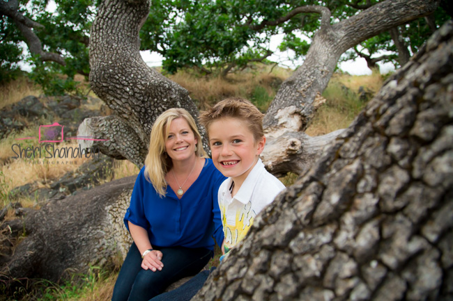


I love the colors of this photo! Nice job! You have the leading lines of the trees going towards the mom and son, with the son in front my eyes are drawn to him first. Great aperture. I am new to taking photos, but I think my suggestion would be rules of third as right now the subjects are in the middle of the photo. Great photo!
Great location, I love the background. One thing I might do differently is put them at the same distance from the camera. The boys head kind of looks large compared to the woman. If you want the boy to be the focal point and blur the woman maybe move her back a little further. I love the placement of the tree in the front, helps frame the two of them and bring your eye to them.
I like the depth the positioning of the woman and the boy give. I think I might try to have a bit wider aperture to have more background blur and perhaps not have so much of the foreground branch taking up the frame. Maybe rotating your angle around to the left a bit? Hopefully you could still keep those great leading lines of the background branches then!
Great shot! Love that tree. Land nice and sharp. I would maybe brighten it up a little bit, not much, just to lighten a few of the shadows. Or warm up the background a tad. Could use a sun flare to do that if you wanted. :)
Hi Sheri, I like how all the branches and roots in the back seem to be leading to the subjects sitting on this interesting three. I would have liked for the big branch in the foreground to take up a little less of the frame and allowing for the cute little boy to peak out a little more.Maybe next time you can try to move over to your left a little to show less of the branch and allow for your subjects to be off to the side as well, vs. centered. All in all I find this photograph very interesting and I like the softness of the colors. Thanks for sharing!
The trees provide a great background. The white balance seems perfect. The positioning of the boy and the mom seems off because he is actually closer to the camera and so he looks bigger than her. It would be nice if they were on the same plane. Also the big tree trunk in the foreground kind of distracts me from the rest of the image. Either have just a little of that showing, or recompose to not have any of it showing. Also, you could position the subjects so that they are more framed by the branches and trunks, and not like they are sticking out of their heads. But it’s clear and bright, and has good potential!
I love this setting! the tree is interesting and adds texture without being distracting. I agree that the two people should be be at the same distance from the camera unless you want one of them far enough back to be out of focus. With this tree, you could do something playful like having them peek around it (or having him peek around from behind her). Or you could go dramatic and more serious. Great location – looks like it would be a fun place to get creative! :)
LOVE the leading lines, minus the branch behind the lady’s head. She seems a bit softer focus, but I think it is a great picture!
Good shot! I love tree shots. I think it would look more soft if you would have used a wider aperture- maybe f/ 1.8 or 2.0 ? You wouldn’t need such a high ISO then and your picture would be sharper. Have fun!
Love it! Seating the subjects in the center of that large, unique tree REALLY gives the photo depth! I would have placed the two subjects closer together. Here, the child’s head looks larger than the adults head. I suspect the child was meant to be the main subject, if so, maybe place the adult standing behind the back branches of the tree, to really emphasis the child (if that was the intent, but maybe it wasn’t). GREAT angle to take the photo from! Most photographers would probably place the subjects in the center and shoot from 90 degrees from where you were standing. But this angle makes it much more interesting!!
Love that they both look so happy and playful. I would try have the front tree be a little less prominent and change the depth of field so the back is a bit blurry. Great getting such a lovely smile out of both of them!
The mother and son duo are fantastic; I love their smiling faces in this shot. I like the trees that are in the background, but the one in the foreground is distracting and cuts off some of the boy’s body. I like that they are in the center of photograph but I would have cropped on both sides to make it look like it was taken in portrait mode, instead of landscape mode. Nice job bringing out their lovely smiles!
I love the location and mix of colors. I think that I would have tried maybe from a slightly different angle, or used the tree more in play with your positioning given this was a posed shot. For instance if your intention was to have the child be the main focus and the mother to be in the background you could have played that up even more dramatically. Over all I think you did a great job capturing the emotional tone, your composition was good, and what a great little spot you found to shoot in! You could do so much with it!
Great shot! I really like the lighting. I think the branch in the foreground draws away from the mom and son. Beautiful scenery/background!
Hi Sheri, What a fun location! Overall, I think the photo is great. I am a bit distracted by the amount of branch in the foreground, and the fact that most of the boy’s body is hidden by it. Pulling him a bit closer to the mom would resolve that issue. I love the mood of the photo.
Love colours in this picture. I’d personally use different angle as this big trunk in the first plan is a bit distracting to me, also the way they sit boy seems a bit unproportional in comparison to the lady he is in the picture with. Also wider aperture would give you nicer bokeh in the backgroundwith. Hope I wasn’t too harsh.
This is a really awesome pic! I think the picture works perfectly not using the rule of thirds. My only critique would be to watch your settings! 1600 iso is a little high (in my opinion) to be shooting in such a bright looking day. Then you could also slow down you shutter speed quite a bit as well. Very nice job!
I really like the genuine happiness in the image :) I would have liked to see the two closer together on the branch so the little guy doesn’t look so much bigger. Maybe with her arm around one shoulder or his waist, just to show their bond ♡ and that they are interacting. I do t love the light and the placement of the subjects though. So cute.
All the colors and textures are beautiful, and add so much visual interest to the photo! The one thing that seems distracting to me is the size difference between the woman and the boy – because of positioning, he seems huge compared to her. Maybe either bringing her forward or rotating the camera so they are on the same plane would even them up a bit. Otherwise, very nice photo, and a unique and open and airy natural setting.
I love the colors, and it is sharp. I saw where others have mentioned the crop. I too would crop this portrait size. I would place them on the bottom left rule of thirds section. The leading lines of the tree branches are awesome.
I love the lines and the tack sharp image. Something is off of the depth of the tree and the proportions of the faces. Perhaps a step to the left and down could have changed that. Other then that a great visually stimulating image!!!
I really like the picture. Good color and very interesting. I only have a question. Why did you choose the setting you used?
Jason
Cool photo with a very interesting background! I would prefer it however with a closer crop on your subjects. I’m drawn more to the unique trees than I am to the mother and son. I think you can still get a sense of the setting if you include less. Other than the crop, I think the exposure is great and white balance looks good.
I didn’t read any other posts yet, so here goes….I like the setting for this. It is unique and creative. The mom and boy both look like they are at ease with the camera too. I would change the tree trunk being so pronounced in the foreground though. I am also wondering why you used such a high ISO….it seems it wouldn’t need to be that high given the lighting outdoors. Overall, I think it’s a great shot with some other optional compositions out of this main idea.
I love the lines in this picture, but the tree branch in front (with a great diagonal line) is a little distracting. My suggestion would be to try a slightly different angle. I love how the tree branches lead you around the picture, and the positioning of the people adds a bit of depth to the image.
Great depth of field. Mom’s head is smaller than the background tree trunk so she doesn’t look like a tree is growing out of her head. My eye was drawn to the trees first instead of the subjects so I would suggest a tighter cropping. The picture is sharp and crisp.
I think this is an awesome photo. I echo some thoughts above using rule of thirds and having subjects in the same focal plane would improve the technical features of the photo. colours, leading lines are nice. To close however, I personally feel having the near tree, the boy, then the lady spaced as they are show a great depth that isn’t often present in photos. If that was the goal of the photo, which I feel it was, it is awesome. Personal creativity trumps the rules, and I think you’ve done something quite nice here.
Beautiful setting and great colors – I would have put them closer together as well or blurred mom slightly to show that he was the main focal point – great smiles and focus is perfect! Nice job!!
I like the shot.
I would have positioned camera a bit more to the left of viewer and zoomed in more, as not to edit cropping.
Less tree bark or un existent.
Have had Mom turn more to camara as She would have more light in Her face and catch eye light.
Would have more Depth of field.
I think the setting is absolutely cool, but I have to admit its a little distracting and seems to be competing with the subjects. Maybe if the background were more slightly out of focus (lower fstop which would allow you to decrease your ISO), it would bring more attention to the mom and son. Having the son closer to the camera makes his head seem slightly larger than mom’s which also throws it off a little. I like the leading branch out of focus, but maybe try positioning them in the middle of the tree side by side. Very cool setting though!
I love the use of all the tree trunks as leading lines in the image! Really cool! I tend to prefer brighter images, so I think I would have done that while editing. They look really sweet together. I think you captured that nicely!
Oh my goodness, I am a nature girl and I love this photo. Great colors, i would crop just a little bit of the tree in front of them and then let their beauty stay the same through out the rest. Love Love Love it!
Thank you so very much everyone! This has been such an amazing experience. I love all of the help and feedback. I have been playing around with the photo and cropping and many of the suggestions are great. I will try different positioning and lower ISO next session I’m there! It’s a beautiful peaceful spot but I do have to admit I am in love with this photo. Thanks again for all you encouraging words and advice. I love to learn and want to just keep improving!
Sheri