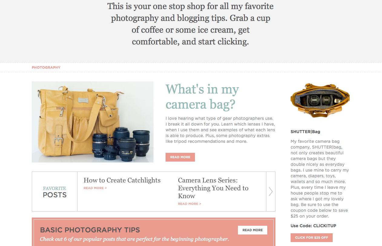
I’m dying to share the new site with you guys. I have been working with Ryan from Second Street Creative since September to give Click it Up a Notch a complete makeover. I can’t say enough great things about Ryan and his team and hopefully I’ll put together a whole post on tips for a website makeover and hiring the right people.
It is bitter sweet to see the current design change, especially since I’m losing the umbrella girl logo. That photo will also hold a special place in my heart and you can read why here – Nobody’s Perfect.
I wanted to give you a little teaser and prepare you as I’m hoping to launch really soon. I don’t want you to think you have come to the wrong place.
The new site will have new pages to help you get to know me, our team of contributors, as well as dive into the information. With over 4 years of info, we wanted to highlight some of the best for you.
One of my favorite pages is the resource page which is full of amazing information on photography and business/blogging. So excited to share this with you!
Please be patient with us as we work out all the kinks after we switch it over. We are hopeful for a smooth transition but you know how technology can be.
Can’t wait!


I love the new design! So clean and “airy”. Seems like the focus will be on the photography rather than colorful page elements. I’m looking forward to seeing it! =)
P.S – your clear explanation of photography basics (aperture, shutter speed, iso) is always the go-to link that I send fellow Etsy sellers to when they’re having trouble!
Thanks so much! Yes, clean was definitely a look I was going for. I figure if my house can’t stay clean at least my website can ;)
Looks awesome!! I can’t wait to see more. Congrats!!!
Thanks Abbe! Me too!
It looks good, very clean and easy to navigate. I can’t wait to see the design fully in action.
Rubi | The Den | http://www.the-den.blogspot.com
Thanks! Hopefully it will be soon :)
Looks awesome! Tell them to give you a custom favicon too.
Thanks Katie! Will do :)
It looks amazing! You really are such an inspiration – I don’t know how you find the time to do all that you do! Can’t wait to see x
If you saw the piles of laundry, dog hair on the floor and dishes in the sink you would see ;) Thanks!
The new design looks great! Looking forward to seeing it live on the site.
Thanks! Me too!
Looks great! After 2 years with my current Theme/Setup I really want to change things up. Have to go to a cave for a few weeks, but someday.
Keep up the good work.
Yes, I understand. I’ve had this design for about 2 years as well. Change can be good but so very time consuming :)
I love it!!! I can’t wait to see the new launch!
Thanks! Hopefully soon :)
It looks a-maz-ing!!! Great job Courtney, you crushed it!!! :)
Yay! You have a great custom favicon!