Remember:
-Read How to Critique a Photo
-Make a critique sandwich – something positive, something you would have done differently, something positive
-My rule: no improvement tip = deleted comment
-This will benefit the person leaving the photo critique just as much if not more than the person receiving the critique.
-If you would like to have an image critiqued be sure to read How to submit an image for critique.
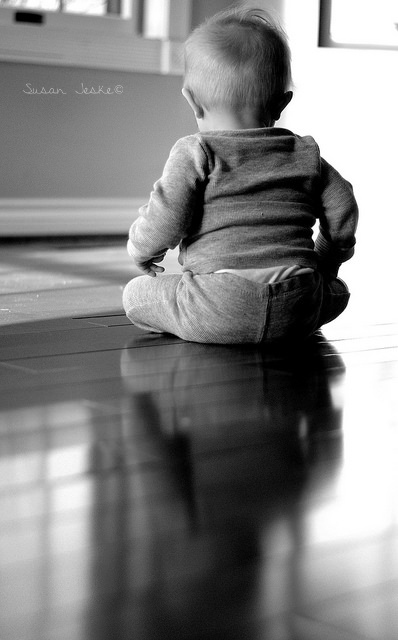
Thanks to Susan Jeske for submitting the following image.
Settings: f/1.8, SS 1/640, ISO 800


I love this shoot, I wouldn’t have such a tight crop on the side and would have shot up a little so you could see more of what the babe is looking at. Love the lighting too!
I agree with the above comment although I’m thinking that you were trying to include the baby’s reflection on the floor. Beautiful idea, but I think it’s just a bit too subtle (if that’s what you were going for) making the photo appear top heavy. Beautiful shot though!
This is a great construction! It is a really good shot. The only thing that seems to be “off” in my opinion is the darkness on the right side of the sweet, little behind. It pulls my eye in that direction– rather than to the child as a whole. I agree with Amanda, having the baby a little more in profile might give your eye a different place to go. But still, the light is good and the picture is really sweet. I could see this in a collage of black and whites with different angles.
Love this. So cute. I would have shot just a little higher…there’s not much room between the baby’s head and the edge. Love the lighting.
Hi Susan!
I LOVE the lighting of this photo! It really reflects the mood of the photo. I noticed that it looks like you were trying to capture the child’s whole reflection. The reflection is a huge part to the photo but, i agree with Amanda, less floor and maybe cropped out farther. A tip my grandpa taught me was to always shoot with extra cropping room. So then you can take away what you need to because you can never add it!
I hope this helps,
Lydia
This is a great shot. I may not havebit that tight above his head,just a tad more room. Black and white was a good choice so we can focus on that yummy reflection :-)
I like where you were headed with this photo but agree with others that there just isn’t enough room at the top. Since you were trying to shoot the reflection, maybe go for a real aggressive crop to a square and chop all or part of baby’s head and include part of the reflection. It would be a little artsy if that is something you would like.
What a gorgeous photo! I don’t know if I can even think of an improvement…maybe that the image is a touch washed out on the right side, so it looks a little harsh. But I love the overall composition and the reflection in that beautifully shiny floor!
I love the black and white. My eye is distracted by the square in the upper right corner, and the window lock on the left.You can clone those out easily. I like the use of negative space, and the soft reflection,as it does not compete with the baby. Well done. The baby is crisp and the bokeh is nice.
Baby bums are the cutest, aren’t they? I really like the simplicity of the picture, and the way you included the reflection in the (spotless) floor. I always forget to look at the reflections. I feel like the lighting splits the picture in half – washed out to the right of the baby but great on the left. Perhaps it would have been different if you had stepped a little counter-clockwise around the babe (to the right). The architecture of the window and the wall to his left is beautiful but simple enough not to distract. I do like the monochromatic finish here – I really underlines the simplicity of the image.
Hi Susan,
I love this in black and white. Other than the above comments on composition/crop I feel that the focus falls on the bum area just a bit too much. I think you did great with the natural light :)
I DON’T THINK I’M IN ANY POSITION TO JUDGE ANYONE I LOVE PHOTOGRAPHY AND FEEL EVERYONES WORK IS UNIQUE, THE BABY SHOT IS ADORABLE, BLACK AND WHITE PHOTOS ARE USUALLY GREAT, I DON’T SEE ANYTHING YOU NEED TO IMPROVE ON WITH THIS PICTURE, GO JOB, I WOULD BUY IT.
I agree that it is a little top heavy in the frame but it is a really nice looking black and white, just the right amount if contrast. Maybe I wouldn’t have included as much of the baby’s reflection but a sweet pic nonetheless.
What a sweet picture!
The way you have the baby reflected in the flooring is perfect – beautiful symmetry with that. (and how in the world do you keep your floors so clean?)
The top right is a bit blown out, if you could somehow tone down the brightness in that corner (I don’t know enough to suggest how you could even do that, though I’m sure you will get some great advice from other critiques).
Lovely photo, and it looks fabulous in black and white.
I love the photo, especially in black and white. I would have left more room atop the photo to match the length of the reflection captured in the floor. Would love to see what the color version looks like.
Such beautiful natural light and it is gorgeous in black and white. I think that right/upper right side is too bright – to my right eye it is a harsh glare when I look at it. Love that little tushie and that little lick of hair sticking up at top. Beautiful black and white shot.
I really like were you where going with this image. I like the negative space of the floor and how the reflection leads to the baby. I think I would change the composition a bit stick to the rule of thirds and step back a bit to try and capture in a landscape as opposed to the portrait. By shooting at an angle, stepping back, and placing the baby on center right third you would still capture the reflection and have the negative space. I hope I’m explaining right I have it in my head but it’s hard to explain with words lol :-). Also the right is a little to bright I might decrease exposure a bit in post. Overall great photo! Good job :-)
Great lighting, and the back of a baby is always so precious in a photo. (I love their little fuzzy heads!) I see what you were trying to do with the reflection, but I think it works best if you can get a clear reflection. Otherwise, it might have been better to shoot down on your subject to a) cut off the windows in the background which are a slight distraction, and b) frame the baby with the lovely shaft of light that is lying on the floor in front of him. Another way to soften those window frames would be some sheer curtains. This would also bring out the softness of the baby’s clothes. Thank you for sharing this photo – babies are so much fun to photograph, and this one is adorable! :)
I like the idea of capturing reflections, especially a cute baby. My only thought is that the wall reflects onto the floor along with the baby so that it competes with the baby’s silhouette. Maybe experimenting by moving, either yourself or the baby, and seeing how the reflection looks. I do like the composition and that its in black & white.
I love it but, as someone already said, I would give more space above and cut some of the floor below. Nice shoot ;)
I like the focus and black and white. The right seems a bit too washed out for me which drew my eyes to that area first. I like the composition. Not knowing what the child is looking at forces me to concentrate on the subject which I believe to be the child.
As others have noted, I also love the reflection of the baby in the floor, the use of black and white, as well as the many subtle textures included in the picture. I, too, wonder what the picture would look like had a tighter crop not been used. As a prior poster mentioned, I also wonder how the picture would look if you played with a square crop so that the focus is solely on the adorable baby butt and the reflection of the baby. Overall, a great shot; a good use of light and reflection and a cute composition!
I love this photo! I did find the right side to be too bright and a bit distracting. Good composition though!
I adore this shot! The lighting is fantastic, and the contrast is perfect. I’d love to see this in a landscape, or cropped a little higher on the top to balance it out. I’m also super jealous of those shiny, clean floors ;)
Love the reflection of this sweet baby and the black and white is perfect!
However, I would of increased the aperture so the reflection of the baby on the floor came in clearer.
Other than that… I wouldn’t change anything else!
Great job! :)
I love everything about this photo! The only critique I can think is maybe have just a teeny bit more space on the top. But really this photo is so sweet!
I absolutely ADORE this photo. Looks gorgeous in black and white. I hate saying anything critical because this really is a great photo. The couple things that stand out to me is the box or window on the right side. I also would have put some extra room above baby’s head. Again, beautiful shot and awesome use of light!
Love the back shots…we seem to forget we need those too. I would have preferred that the pants be up over the diaper and perhaps cropped more of the reflection off. I do love reflections, however this just seems like a bit much. Great editing and composition always make things that could be wrong, so much better.
I love the back shot of this baby and the reflection in the floor. Since this is my very first critique…ever…I’m not sure how to express myself. What stands out to me is the extreme brightness in the upper right vs the darkness in the lower right of the photo. To me, it seems a little hard for the softness of a baby. I love the details and softness of his hair on the left side. Very nice shot!
So cute! I love the back view and the little bum is just too cute. I am betting it was hard to keep this little guy sitting still long enough to get a good shot so great job!
I think there is a bit of unbalance between the darker left side of the photo contrasted with the bright white of the right side. Maybe a little bit too much floor in the foreground but wonder if you were trying to capture the baby’s reflection?
Great sharp photo!
Love it in b&w…could have shot from a little further back…Love the lighting in this image.
I would crop at the bottom. You don’t need to see the entire reflection to get the point. It is a very sweet photo.
Wow, what a lovely shot. I would have panned out a bit more to include what is above his head, it made me want to see what he is looking at. I absolutely love the way you did the black and white and love the reflection of the baby on the Harwood floor. Love it! Great job.
I love the back shot of the baby, but I would have tried shooting at a different angle because the reflection is too subtle. I love that the image is in B&W instead of in color, and it’s so sharp!
The lighting is good, but the highlight and shadows seems to be slightly blown-out. Avoid pushing your highlights and shadows to 100%, this will create “hot spots” where there is no information in the photo. I would suggest a starting point of 3-5% (lightest) to 95-97% (darkest). I agree that the top is cropped slightly too tight as well. It also looks slightly off center which I am assuming you are going for centered (left to right). I might also think about removing the windows in the background or opening the aperture just a little more for better boken. Love the choice of going blk/wht and the positioning of the baby.
I love that you have the baby’s reflection included! I would’ve tried moving back a little bit, so you see more of the baby, not just the reflection. Love the lighting as well
Babies make my heart smile, and this picture definitely made me smile. It’s beautiful light, and I love the reflection. You could have zoomed out a little so you had more breathing room at the top and could still see the reflection. I think it is a beautiful picture and the Black and white was a great choice!
Such a sweet image! I really like the reflection in the wood! Hard to find anything that would make it better but for the rules sake…
I would make the composition slightly different, by adding more to the overall image on the sides/above the head. It might tell the story a bit better. Overall, I just love the photo! Great job in capturing this sweet little one!