Design helps bring order to documentary photography which isn’t meant to be perfect or planned by any means. I love the documentary process because it encourages authenticity. It inspires people to embrace what makes their lives worth sharing beyond the perfect smiles and posed occasions.
Table to Contents
What is Documentary Photography?
Documentary photography is a photography style that tells the story of what is actually happening. It authentically captures the subjects, environment, and event that is happening.
What I lack in posing – I make up for in storytelling and design. That is what documentary means to me. I’ve always felt like the environment should play a serious role in making an image mean something to the viewer.
Just for you- Lifestyle Photography Tips for Photographers to Use Today
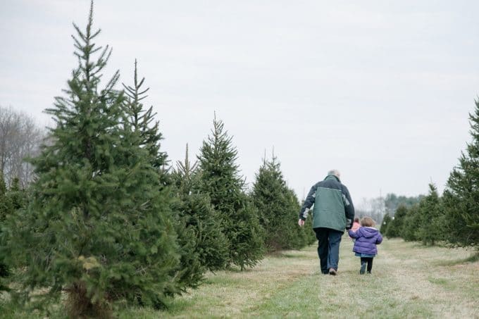
What is the purpose of documentary photography?
This style of photography is very important to the art of photography. It’s the way historic events are captured. From births to sporting events and everything in between.
See here for more on How to Take Creative Lifestyle Newborn Photography Photos
Documentary photography is also used in day to day life to sort of journal what life is truly like.
This is the opposite of a staged photoshoot where the photographer directs the subjects and makes the scene nearly perfect.
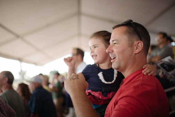
How to shoot documentary photography?
When I walk into a home or shoot my own children – I tend to look at the scenes I photograph in the following order:
1. Using the environment to piece together effective design.
2. Light versus Shadows.
3. Client Interaction.
8 ways to weave intentional design into documentary photography
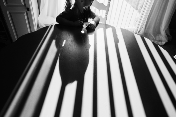
Lines and Shapes
Lines and shapes can be used together to create visual interest via scale, emphasis, and pattern.
A great place to start is to look for horizontal, vertical or diagonal lines from any edge of your frame and lead the viewer into the subject.
You can also look for repeating shapes to create a similar effect.
Just for you- How To Use Leading Lines To Create Amazing Photos
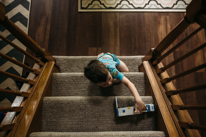
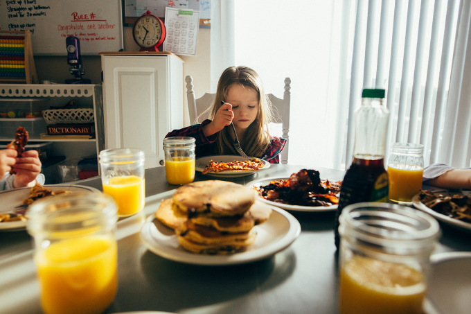
Repetition and Rhythm
Repetition is a great way to create unity and visual rhythm – a visual echo, if you will.
Oftentimes it helps to reinforce the story behind an image as well.
Repeating shapes or objects can lead our eyes into an image or serve as an interesting backdrop.
Motion
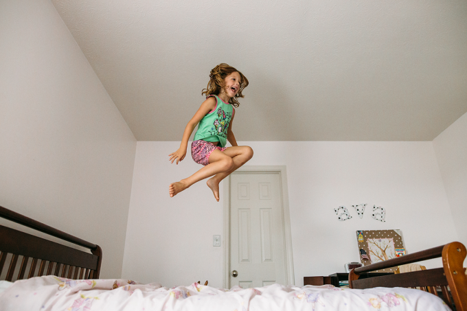
Motion is something we consistently think about in photography. Even when we aren’t thinking about it in design terms – we are thinking about it technically when we adjust our camera settings.
There are so many ways to capture motion in our images and for a variety of different reasons.
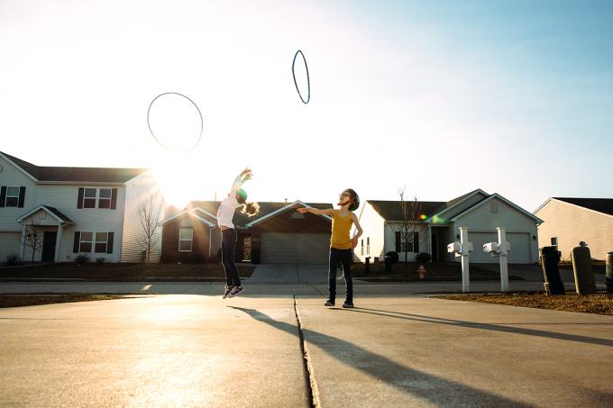
Freezing action or intentional blur are a couple of common things I see across the industry.
Motion doesn’t particularly have to be dramatic – it can be still. It can be impending. Motion adds life to our imagery.
See more on motion here- How to Take Unique Photos that WOW Using Slow Shutter Speed
Read more: Top 9 Tips for Remarkable Street Photography
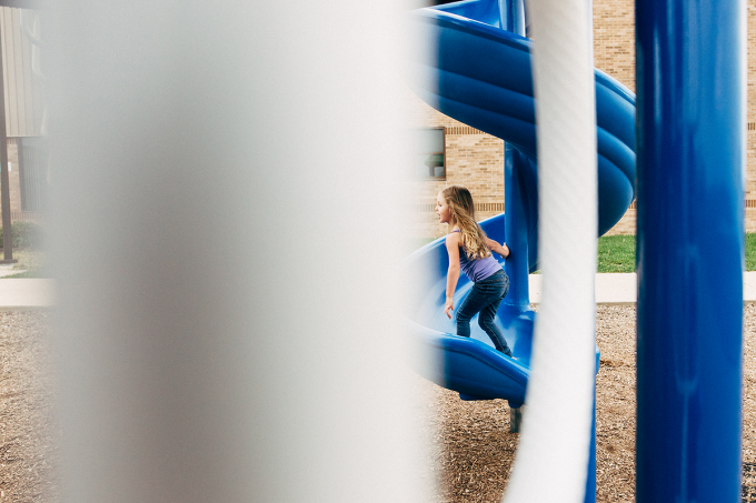
Framing
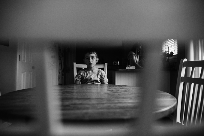
Framing your subject with the environment is a great way to hide behind stuff and stay back.
I love working like a “fly on the wall.” In some instances, framing can translate the space and really add to the story while at other times it merely adds depth and dimension.
Here is a bit more on framing- 4 Unique Framing Photography Composition Ideas for Creative Photos
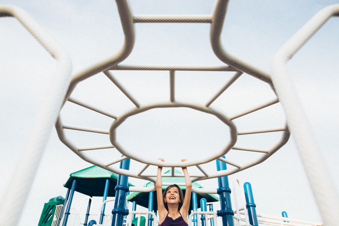
Symmetry
I love symmetry. Symmetry and balance make my heart – oh so very happy. No matter what I am photographing – I look for a sense of balance between my subjects and their environment. Symmetry is all about balance.
You can create a sense of symmetry or asymmetry by utilizing color, eye direction, lines, pattern, shapes, texture, and value. Symmetry may prove to be the biggest unifier of all design basics.
When several of these pieces co-join – you experience exceptional and functional design.
Just for you- Photography Composition Series: Creating Balance & Symmetry
Value as Emphasis
Value is the measure of light and dark. Look at your environment in “value” or “light vs. dark” and you’ll begin to see more opportunities for creative control of the light.
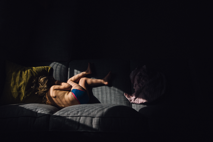
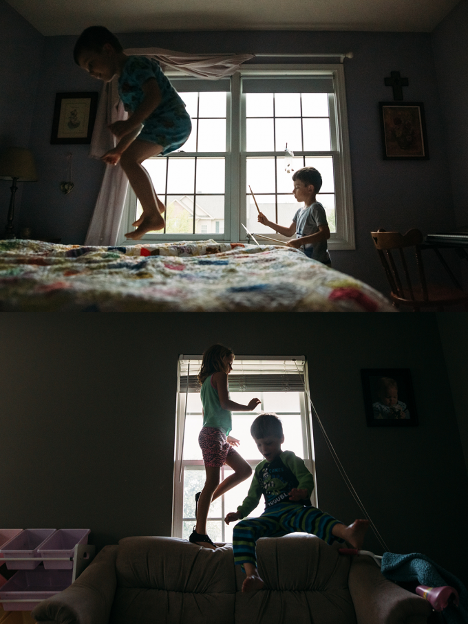
Silhouettes are the perfect example of “value as emphasis.” They are another favorite technique of mine. I also love using pockets of light to create emphasis in my imagery.
See more- Everything You Need to Know to Capture & Edit a Stunning Sunset Silhouette
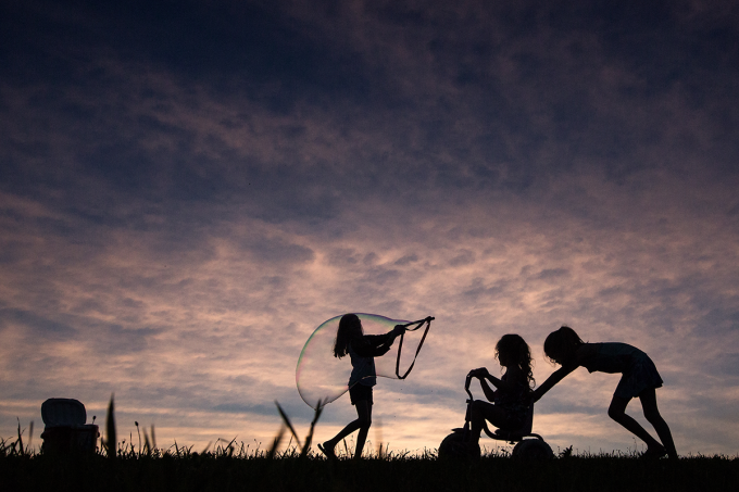
Color as Emphasis
The basics of color as emphasis include understanding how colors work together and noticing when they work together or against each other in an image.
A huge benefit of documentary photography is that we as photographers get to let go of a lot of the control when it comes to wardrobe.
Color still evokes a response from our viewers so it’s important to take notice of its qualities, values, and dominance in an image.
Perspective
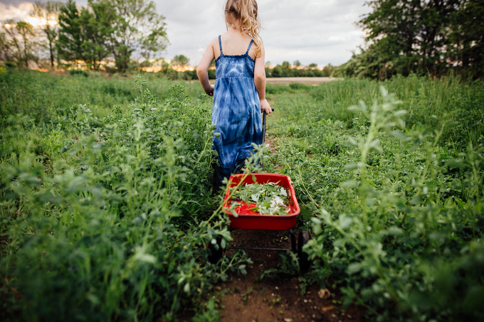
It is my opinion that perspective is a key element to creating interesting imagery in documentary photography. It’s how we translate what we see in real life into two dimensions for our viewers.
Learning to do this effectively while overlapping some or many other design elements is how we can master design and composition in our everyday work. There are so many ways to spin perspective and while I say it’s the most important element – it is also very personal.
See more on 11 Photography Composition Rules to know to Improve Your Photography
How I see the world may not be the same way you see the world. I generally shoot from an environmental perspective by overlapping objects, framing my subjects or shooting from a place that makes my subjects appear a certain way in contrast to their surroundings.
Below you will find two different images from two different families – photographed months apart. You’ll find some consistencies. I work toward similar design aesthetics in all of my photographs.
If you were to pull together similar images from several sessions – what would the consistencies say about your eye for design? How do you see the world?
What is the best lens for documentary photography?
The best lens for documentary style photography is one that you are most comfortable with. As always I suggest either a prime lens or a fixed aperture zoom lens.
I love using a 35mm lens or a 50mm since both of these are relatively small and still give you a great shot. These lens also provide you enough room in the frame to be able to use indoors and basically anywhere you go.
Not sure which lens to use here’s a bit more for you- The Ultimate Lens Comparison for Finding your Perfect Lens
Document using what you have
I guess what I’m trying to say is that while you look to document the “moments” – try to stop and utilize your surroundings too. Use everything around you to add to the story in a frame.
Don’t be afraid to document the dirty dishes, dramatic shadows or a floor full of toys. These sorts of things add dimension and depth. They cater to the design and take documentary to the next level when you embrace them.
What is your favorite thing to capture?




Great post Jamie! Your images are soo beautiful. You have captured everyday moments in a magical way by incorporating design elements. Love it!
Thank you, Kristen! I appreciate it!